
Use Charts to Visualize Your Pipeline and Track Project Progress
See Your Pipeline Without the Spreadsheet Chaos
With Glint's workspace, you can move projects from first site to final approval faster and with less scattered data. But without visualization, managing large portfolios can feel overwhelming. Charts take your project management to the next level, helping you spot trends, catch bottlenecks, and make confident decisions.
With Glint charts you can:
- Visualize your pipeline in real-time — No more exporting to Excel or rebuilding the same spreadsheets every month. Charts update automatically as your team works—when a project moves stages, the chart reflects it instantly.
- Make faster, better decisions — Looking at 50 projects in a list can be overwhelming. Charts let you quickly spot which projects are stuck in permitting, which regions need more resources, or which developers are overloaded—without hunting through rows of data.
- Skip the complicated BI tools — You don't need a data analyst to understand your pipeline. With charts, anyone on your team can create meaningful visualizations in a few clicks using the interface they already know.
In this guide, we'll show you how to create a chart and discuss ways you can use them to improve how you track and manage renewable development projects.
How Your Projects Become a Chart
Charts work just like any other view in Glint—you're looking at the same project data, just visualized differently. Your projects don't live in the chart; the chart is simply one way to see them.
To create a chart view, navigate to 'Company Dashboard'. Select "Charts" and you'll see your entire pipeline visualized instantly.
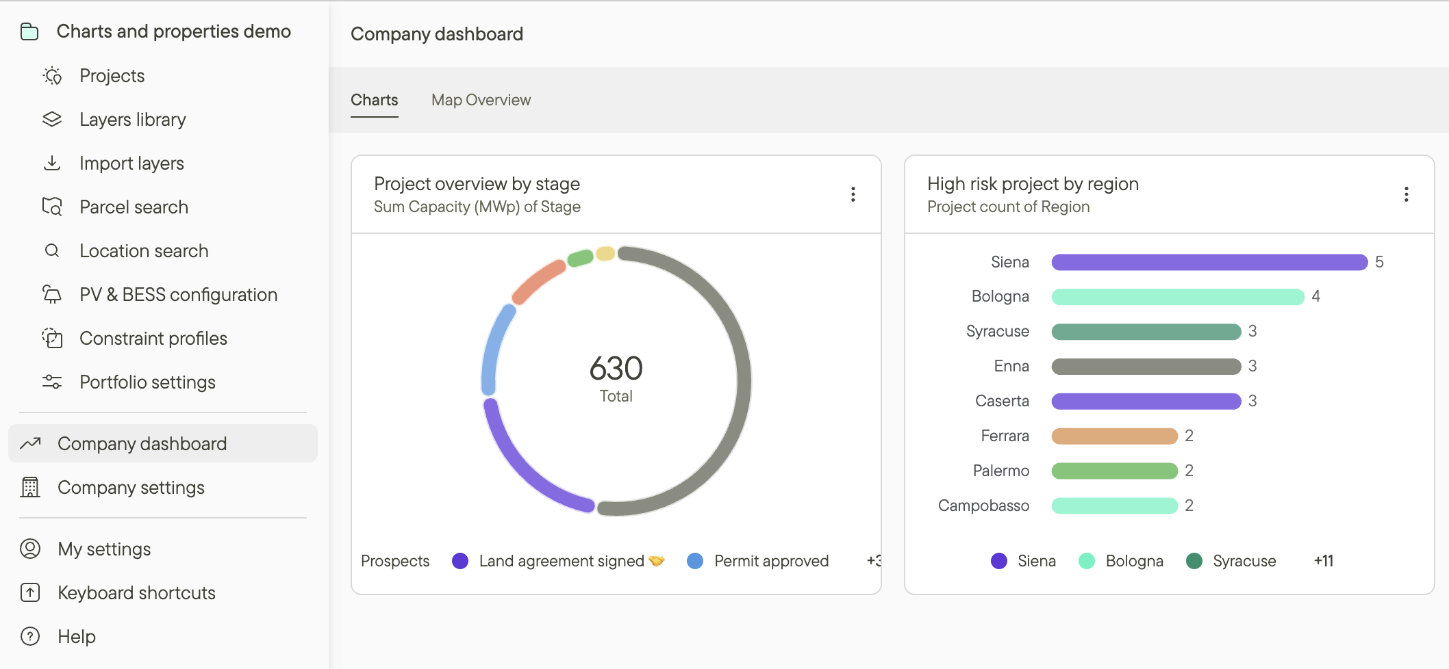
Within your chart view, you can filter your data and customize how it's displayed to get exactly the insights you need.
Chart Types: Pick the Right View for Your Question
Glint charts come with multiple layout options, each serving a specific purpose:
Horizontal and Vertical Bar Charts for Stage and People Breakdowns
Bar charts let you see how projects are distributed across categories—perfect for understanding your pipeline by development stage, region, or technology type.
For example, you might use a bar chart to see how many projects are in each stage (Screening, Land Secured, Pre-Design, Permitting, Grid Secured). Or break it down by region to see where your portfolio is concentrated.
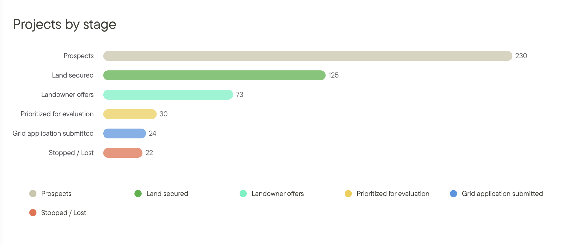
Bar charts give you a clear picture of project distribution across stages, regions, people or any custom property.
Donut Charts for Simple Distribution
Donut charts are perfect for seeing proportions at a glance—like what percentage of your projects are assigned to each developer, or how your portfolio breaks down by risk level.
For example, you might use a donut chart to quickly see that 60% of your projects are in early stages, 30% are mid-stage, and 10% are late-stage.
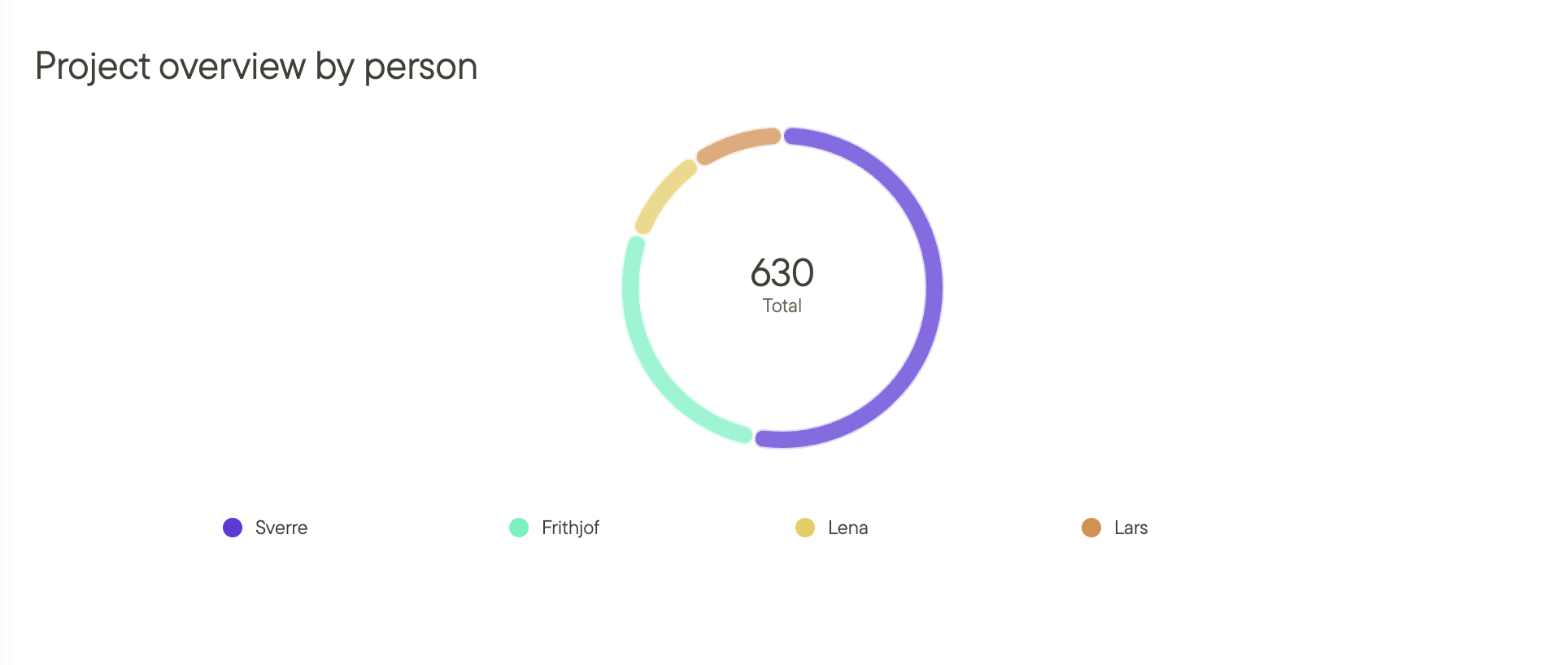
Donut charts make it easy to see proportions and workload distribution.
Capacity Views: See Megawatts, Not Just Project Count
Every chart type can show either project count OR total MW capacity (and any other numeric property you might have added). Switch to capacity view to understand how much power your pipeline represents at each stage.
This is critical for reporting to finance teams, investors, or leadership who care about gigawatts, not just the number of sites you're tracking.
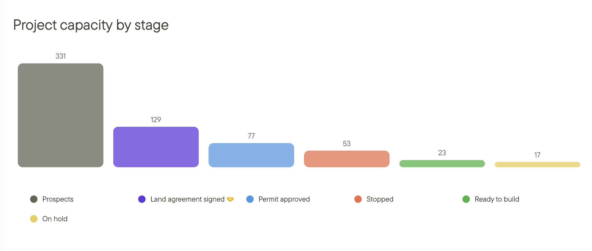
Toggle between project count and MW capacity depending on what matters for your question.
Customize Charts to Match Your Workflow
Since charts visualize your custom properties, they automatically adapt to how you work. The properties you define—your stages, your risk categories, your regions—become the dimensions you can chart.
Common properties development teams chart:
- Stage (Screening, Land Secured, Pre-Design, Permitting, Grid Secured, etc.)
- Region, Market or Portfolio (Texas, California, Southwest, France, Germany, etc.)
- Developer (who's assigned to the project)
- Landowner Status (Initial Contact, Negotiating, Option Signed, Lease Signed)
- Risk Level (Low, Medium, High)
- Technology (Solar, Storage, Hybrid, Agrivoltaics)
- Grid Status (Study Requested, Study Complete, Interconnection Secured)
- Permitting Stage (Pre-Application, Submitted, Under Review, Approved)
The more structured your custom properties, the more powerful your charts become.
3 Ways Development Teams Use Charts
So how can you use charts to improve your renewable development workflow? Let's look at three common use cases.
1. Track Pipeline Health Across Regions
Charts help you understand where your portfolio is concentrated and where potential risks or opportunities exist. By visualizing project distribution across regions and stages, you can make smarter resource allocation decisions.
You might create:
- A bar chart of project count by region to see where you're building momentum
- A donut chart showing stage and filter different regions to identify where each market stands in development
- A capacity view (MW) by region to understand which markets represent the most potential value
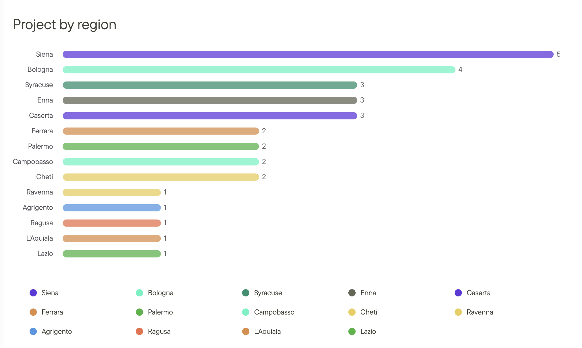
Quickly see that your Texas pipeline is concentrated in early stages while California projects are further along.
2. Identify Permitting and Grid Bottlenecks
One of the most powerful uses of charts is spotting where projects get stuck. If 40% of your portfolio is waiting on grid studies, that's a signal to prioritize interconnection work or reallocate engineering resources.
You might create:
- A bar chart of projects by permitting stage to see where delays are happening
- A chart filtered by "Grid Status" to understand how many projects are waiting on utilities
- A risk-level breakdown to identify which high-risk projects need immediate attention
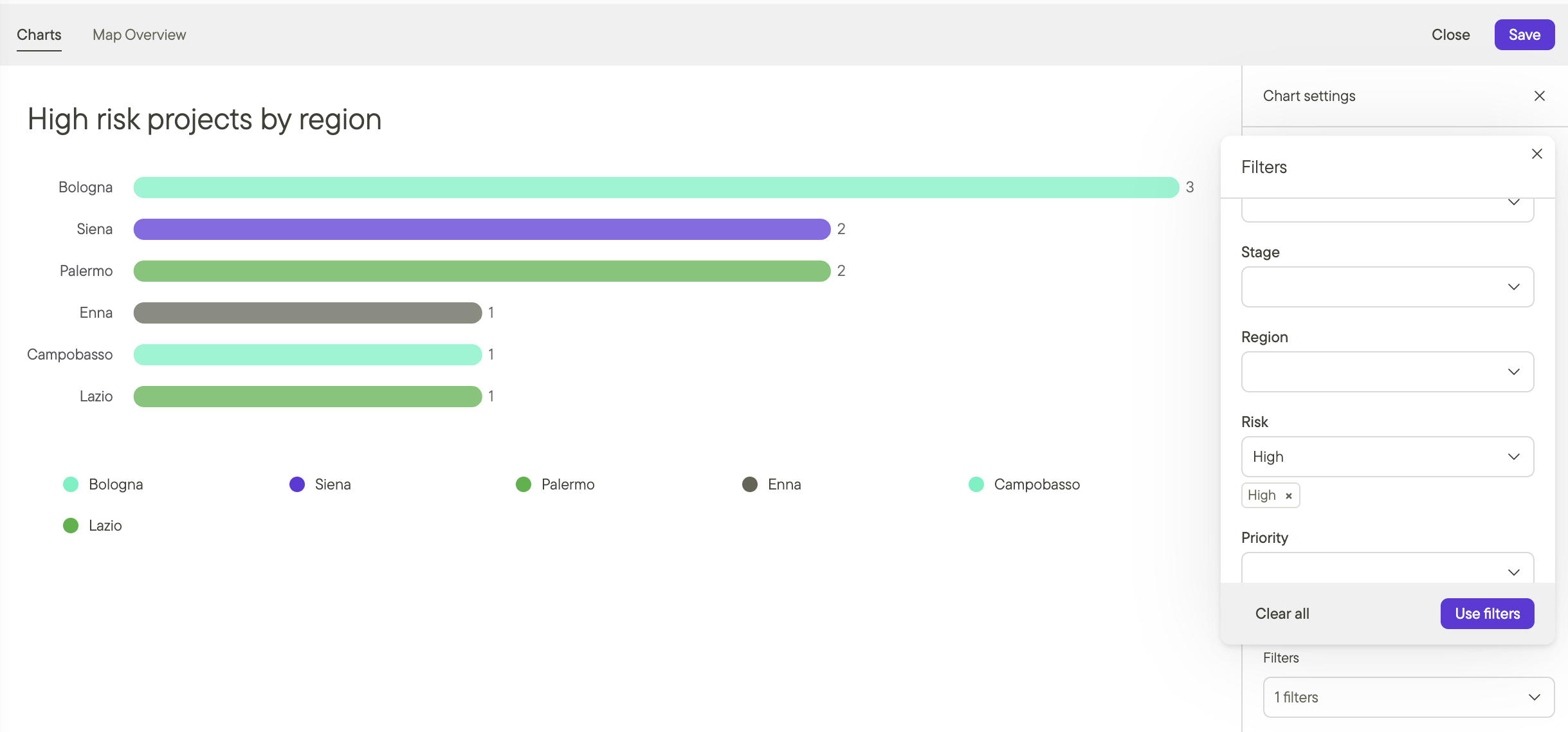
This chart reveals that most projects are stuck waiting for grid studies—time to prioritize interconnection work.
3. Balance Workload Across Your Team
As a development manager, you need to know if work is evenly distributed or if certain team members are overloaded. Charts make this visible in seconds.
You might create:
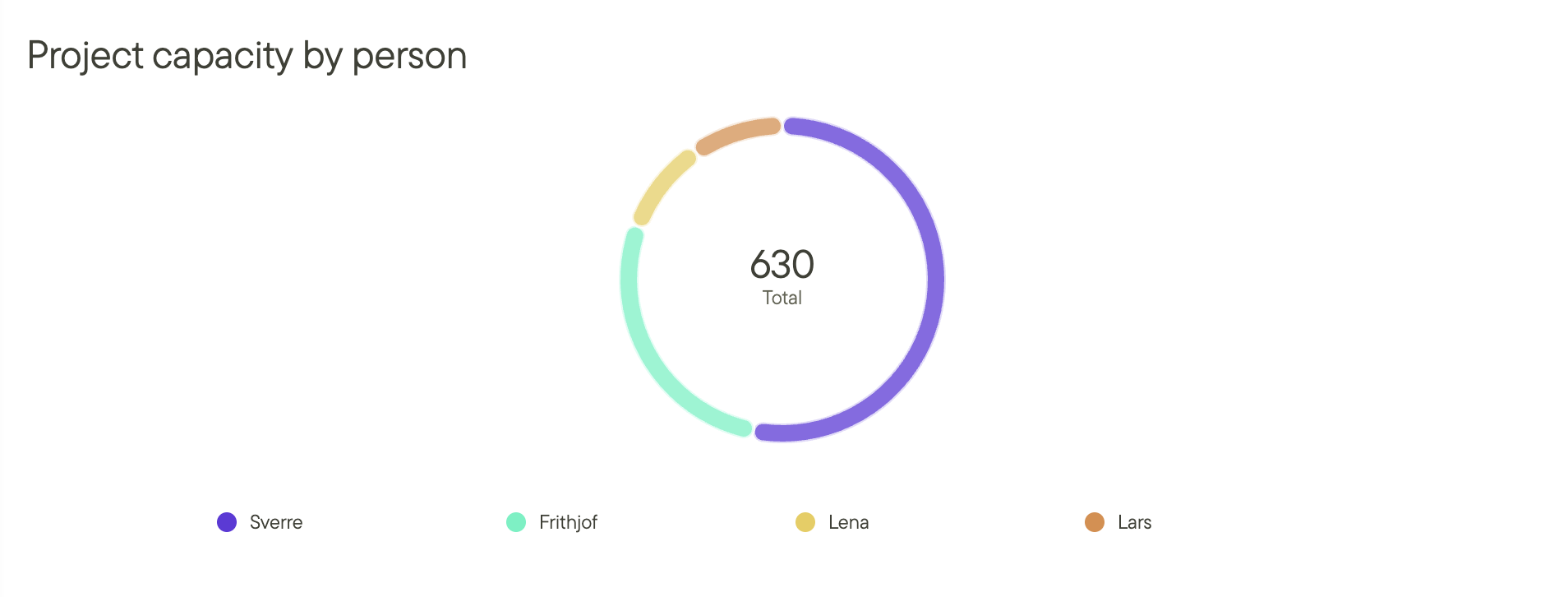
- A donut chart showing project count by assigned developer
- A bar chart of projects by developer filtered by stage to see who's handling late-stage vs. early-stage work
- A capacity view (MW) by developer to understand who's managing the largest projects
Take Your Project Management Further with Charts
While this guide covers what you need to get started, the possibilities are nearly endless—especially when combined with other features in Glint. Here are a few more advanced ways teams use charts:
Filter Charts by Multiple Properties at Once
Want to see high-risk projects in California that are stuck in permitting? Apply multiple filters to narrow your view to exactly what matters.
Stack filters to answer complex questions like "Which high-risk California projects are in permitting?"
Export Charts for Management Reports
When it's time to report to leadership or investors, click "Export" to download your chart as a PNG. Drop it straight into your slide deck—no rebuilding required.
Turn hours of manual reporting into 30 seconds of export + paste.
Create a Pipeline Dashboard
Since you can build your dashboard in Glint, consider combining multiple chart views to get a complete picture of your portfolio.
A typical dashboard might include:
- Pipeline by stage (vertical bar chart)
- Capacity by region (donut chart, MW view)
- Projects by developer (horizontal bar chart)
- High-risk projects (filtered chart)
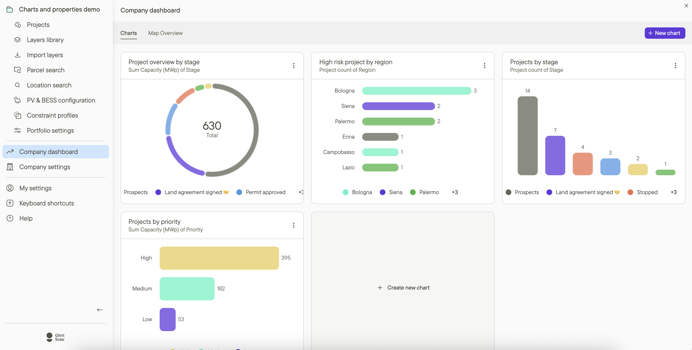
Combine multiple charts into a dashboard for comprehensive portfolio visibility.
Track Progress Over Time
Charts are time-based so you can see how your pipeline evolves week-over-week or month-over-month by choosing to view historical data. Track velocity, identify slowdowns, and forecast future capacity additions.
Get Started with Charts Today
Charts are included with all Glint plans that have custom properties enabled. If you're already using custom properties to structure your project data, you can start using charts right now.
Not sure where to start?
- Set up 3-5 essential custom properties (Stage, Region, Developer are good starting points)
- Create your first chart showing projects by stage
- Apply a filter to narrow down to a specific region or risk level
- Export and share with your team
When used consistently, charts become a powerful tool for understanding your portfolio, spotting problems early, and making faster decisions.
Additional resources
Read more about how to set up custom project properties.
Learn how to create your first project in Glint Solar.
Check out our full onboarding tutorial videos here.